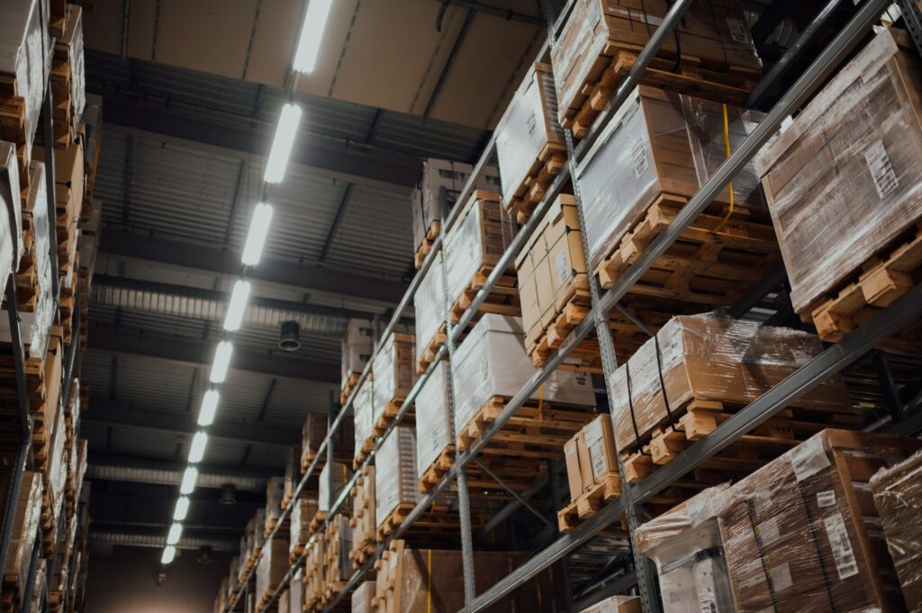

Why Your Business Needs Third-Party Logistics (3PL)
In this blog, we will look at why outsourcing logistics may be what your business requires.

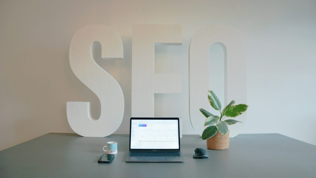
Why Links Are Not the Only Thing That Matters in SEO Anymore
If your strategy is still focused only on links, you are likely missing a big part of the picture.

How Banner Images in WooCommerce Improve Product Page Engagement
Discover how banner images in WooCommerce boost product page engagement, enhance user experience, and help turn visitors into paying customers.